
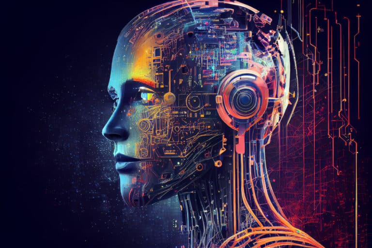
Exploring AI’s Next Frontier: New Beings AI eBook – Edition Two
AI in software development: the latest security analyses, integration of automated accessibility testing, and the acceleration of unit testing for robust web applications.

New Beings AI eBook – Edition One
Unlock the secrets of AI in software development, offering in-depth analysis on AI’s legal landscape, applications, and future.

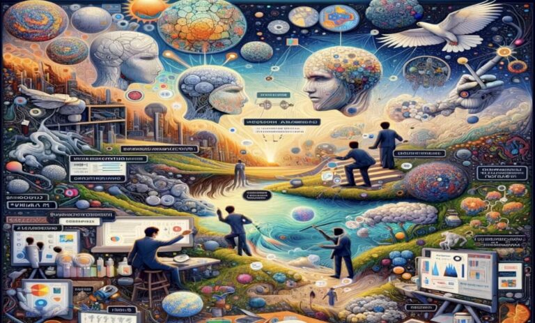
AI Futures
AI Futures explores the exciting yet concerning potentials of AI, including AGI’s future, evolving development tools, and the transformation in business processes.

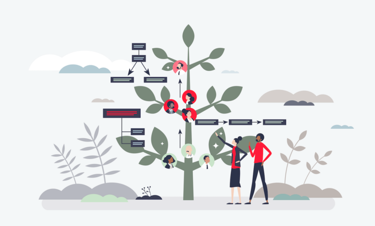
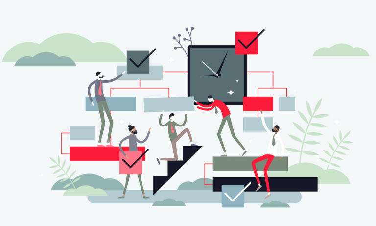
Zenitech reinvents workspace design with a modern asset management system. From conference trial to business-wide implementation, a game-changing project.
Explore the transformative journey of Trunk Based Development in software engineering, a method that revolutionises integration and team efficiency.
Are we entering a new era where artificial intelligence (AI) not only understands our preferences but also safeguards our digital identities? In …
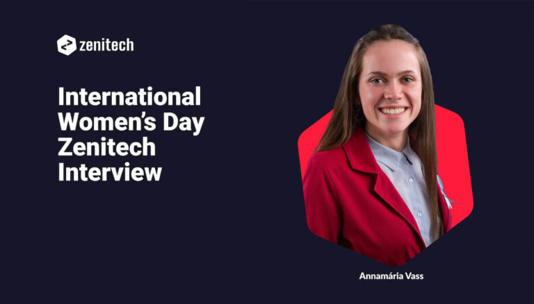
This International Women's Day Zenitech's Annamária Vass shares her experiences and insights on women's empowerment in technology.

Explore Zenitech's innovative approach to a personalised job marketplace, enhancing user satisfaction and efficiency in the gig economy.

Zenitech reinvents workspace design with a modern asset management system. From conference trial to business-wide implementation, a game-changing project.
Gain expert insights on coaching and mentoring product managers with Kay Sogo. Explore leadership skills and personal growth strategies.
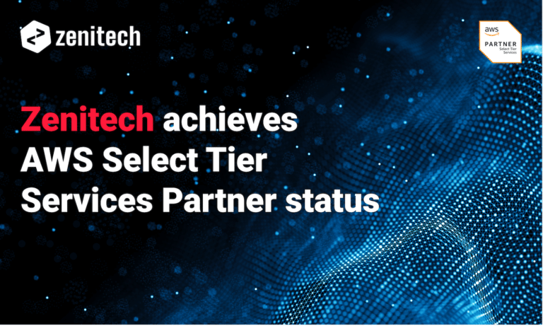
Zenitech joins AWS Select Tier, enhancing cloud solutions with certified expertise. A milestone in tech innovation and customer service.

Unravel the complexities of integrating geo-mapping services in software development. Insights for navigating challenges and achieving efficient integration.
AI in software development: the latest security analyses, integration of automated accessibility testing, and the acceleration of unit testing for robust web applications.

Technological trends in recent years have increasingly moved towards the development of services that are as small, fast, and resource-efficient as possible. …

Discover effective methods for hosting SPAs in Azure. Uncover advantages, challenges, and solutions tailored for Azure.

Unveil the secrets of .NET and Keycloak integration: Client logins, backend authentication, and REST API usage made easy.
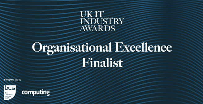
Origami & Zenitech earn finalist spot for Development Team of the Year, innovating the UK's energy tech sector.
Explore Keycloak for superior user management in apps. Secure, efficient, and versatile IAM integration.
Delve into the art of DevOps—beyond tools to culture, communication and creativity, for a unified, value-driven approach to software development.
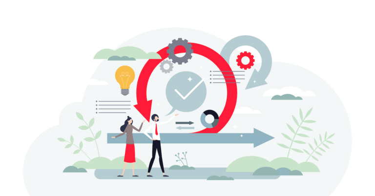
Dive into actionable tips to refine your Agile practices, foster a feedback-rich environment, and boost team collaboration for a happier Agile experience.
Unlock the secrets of AI in software development, offering in-depth analysis on AI's legal landscape, applications, and future.
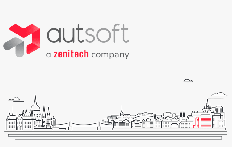
Zenitech finalises integration of Budapest's AutSoft, unlocking a synergy of tech expertise & innovations across Europe.
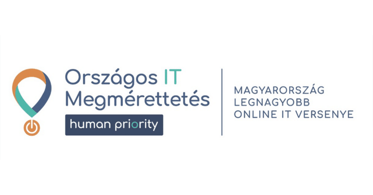
A Zenitech idén is örömmel támogatja a 2023-as Országos IT Megmérettetést, amely immár hetedik éve Magyarország legnagyobb online informatikai versenye. A Zenitech …

Discover Zenitech's insights on end-to-end (e2es) testing. Learn the pros, cons, and techniques for a robust software testing approach.


